R. Craig Collins >
Web Page Design >
Web Page Design Tips
R. Craig Collins >
Web Page Design >
Web Page Design Tips
Web Page Design Tips ©
R. Craig Collins, 2007
Tips
- Web pages should be easy to read, with good contrast between background
and text (see colors and
making background images)
- Web pages layout and design should be consistent throughout the site (see
CSS)
- Web pages should be easy to navigate, with link destinations clearly labeled,
and links back to your main page; consider a navigation bar on the top or
side (see links, tables,
and frames)
- Web pages should be quick to download (see optimizing)
- Web pages should be easy to find (see
MetaTags)
Basic Design Principles
- Balance and Proximity
- Don't align everything to the left, use tables to place text and graphics
across the page , too
- Avoid too much symmetry on a page, to keep interest up
- Place related items close together
- Use white space
- Use white space to enhance groupings by surrounding related items
with space
- White space can also separate items, to add focus, and improve readability
- Contrast and Focus
- Occasionally,
vary typefaces, colors, sizes, etc., to increase emphasis
- Don't forget the main idea of the page, and design the page to draw
attention to that area
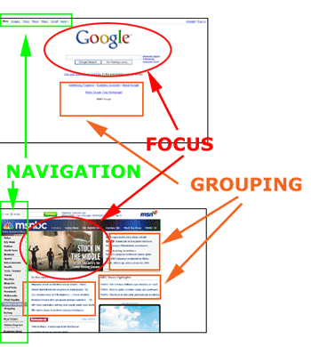
There is no magic formula to making an attractive web page. As a study in different
approaches, consider web sites like Google (that use a lot of white space to
focus you on the search box) and news sites like MSNBC ( loaded with information,
using a large graphic, grouping, or colored headlines to draw your attention
on a crowded page).
Finally, draw out a design or two BEFORE you start coding.